Get Mercy – Brand Identity and UI/UX Case Study
Amanda Łażewska

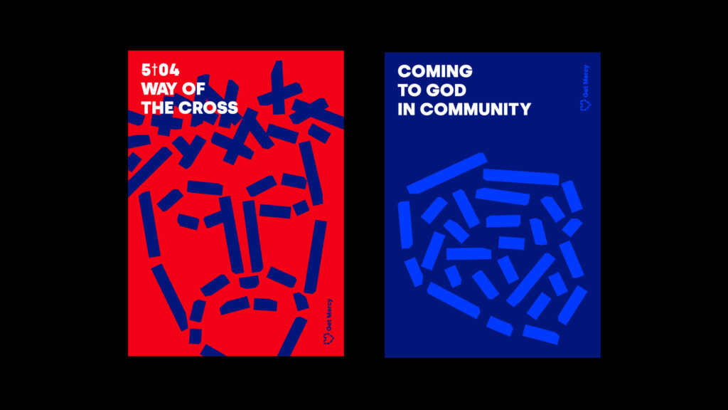
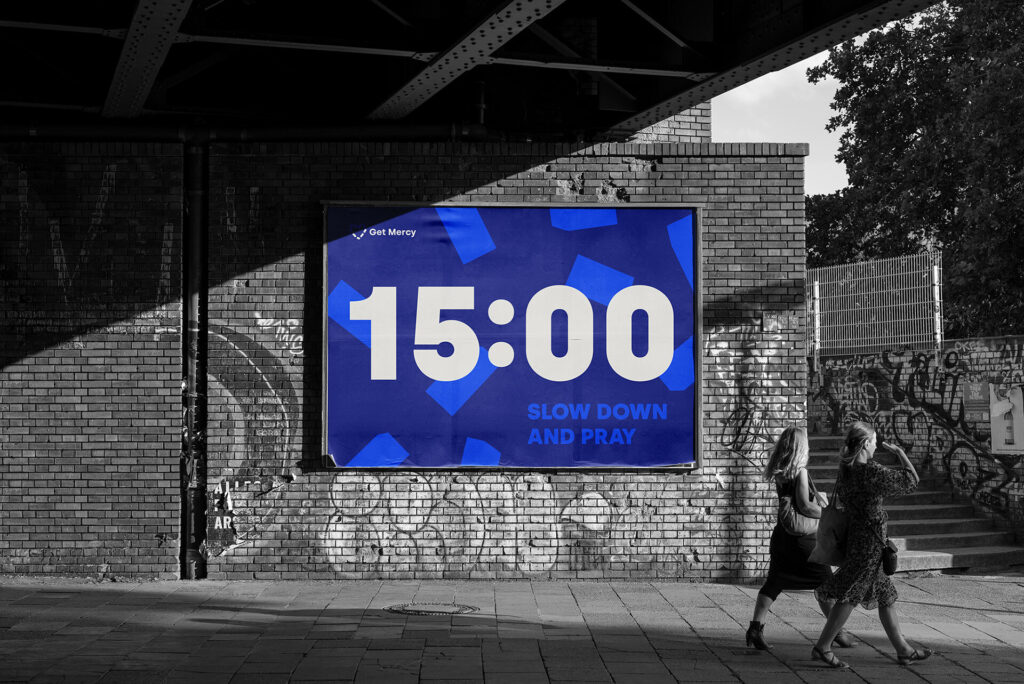
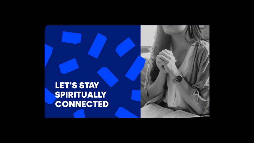
The Get Mercy project is an initiative of the Misericors Foundation, established in 2015 by an IT entrepreneur and a priest of the Archdiocese of Cracow. The main goal of the project is the implementation of St. John Paul’s II call to the 'new imagination of mercy' – on a digital continent, using the latest communication technologies, available in many languages.
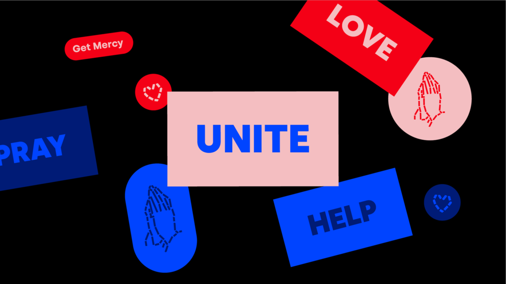
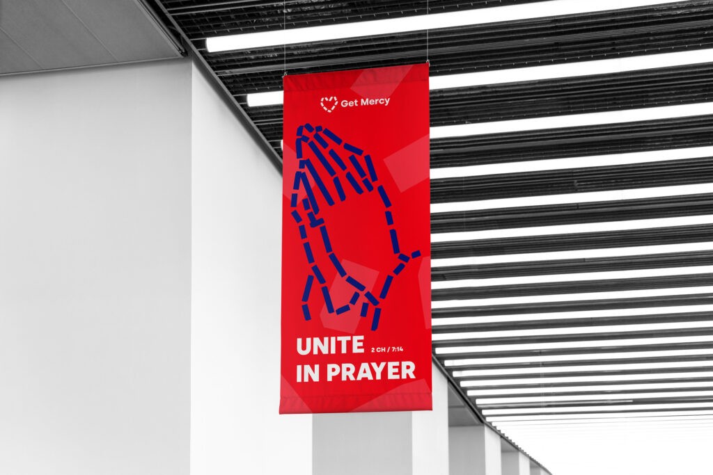
Our role was to design a brand identity for the initiative and UI/UX for the web and mobile apps – one of the components of the movement. Its goal is to unite people all over the world around the celebration of good deeds, praying for each others intentions and building a modern Christian community without any cultural or language barriers.

Thank you!
Hero/dot is a multidisciplinary team of skilful designers, developers, and strategists who work together to develop striking digital products.
We are a trusted partner for many renowned companies, including major sports organizations and enterprise companies.
Want to work with us? Contact us via hello@herodot.com
Need expert assistance with your digital project?
