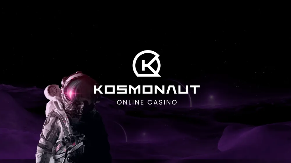
Kosmonaut Online Casino Brand Identity Design
Amanda Łażewska

Kosmonaut is a licensed online casino, initially based in CIS countries. Our task was to design a completely new brand and guide its launch.
The Project
Have you ever been to an online casino? It’s still the same old slot machines, poker, roulette and blackjack, but in this release they’re… colourful. And that’s actually an understatement. Online casinos are a garish, motley colour bomb with all sorts of personified animals, fruit, and other, even less expected motives. They’re almost like a children's playground, except… they’re certainly not a children’s playground.
When we got asked to design a full brand from scratch for an online casino, we most definitely felt challenged. The market itself was sort of an issue, setting standards different to those typical for modern design. Somewhat forced to push our creative boundaries, we made the most of this niche, combining benchmark tendencies with our own touch.
The Process
Discarded Designs
Our first attempt at the design attempted to convey the mystique and old-school/vintage feeling of the 20th century space explorations. We noticed that NASA photographs from Neil Armstrong’s space landing were covered in regularly spaced “registration marks” (thin crosses on the camera lens, ensuring preservation of exact geometrical measures).
Embracing this detail, we created modular grids, which established the design’s layout. We filled it up with photorealistic visuals, outlining space in an austere, yet mystical nature.
 The first look&feel we designed, although visually compelling, didn't hit the tones we targeted as for the online casino
Although successfully creating what seemed to be a “space vibe” of the visuals, we came to a conclusion that the design needed more vibrance, vivid colours and overall visual attractiveness to seamlessly to take place among online casinos. That’s when we went full flashy and severely simplified the design, making it much closer in both look and feel to the games found in such environments.
 The second design was a step too far – too flashy to be in any way recognisable in the online casino market
We were still far from satisfied. We began searching for a golden mean between both approaches – objectively (according to popular standards) aesthetic design, typical for e.g. Scandinavian casinos, whilst not neglecting the players’ tastes and habits. The casino’s design – as we finally established – had to be both flashy and subdued, revealing and mysterious. Exciting.
The Product
The New Design
The name “Kosmonaut” and the entire interplanetary vibe around the project are a nod towards the ever-present fascination with discovering space in the Russian culture. Kosmonaut, the word for astronaut, served as an inspiration for the logo. It is formed by the letter “K”, merged into a space helmet.
The logo, being simple and minimalistic, can be used both with and without the typography, easily adapting to different media channels. For social media purposes, just the brandmark, fitted into a square, is used.
 The Kosmonaut Online Casino logo
The logo’s main typography is based on the font Elevon, with significant changes to the glyphs, intending to match typefaces used in science-fiction designs (for example, the crossbar in the letter “A” has been removed, just like in the NASA logo). Furthermore, the rounded edges didn’t correspond to the logo, hence the decision to sharpen the edges. The secondary typeface, used for the phrase “Online Casino” is Poppins.
 Above: 'Kosmonaut' written in Elevon
Below: our custom typeface
The aforementioned golden mean proved to be a compound of photorealism and characteristic online casino elements, all topped off with vibrant, neon colours. From the first design we took the astronaut figure, which became the focal point of all visuals. The project’s intention was to be familiar to the players, at the same time setting a new standard of using modern design in the industry.
The colour palette is a combination of dark and mystifying shades of space, with vibrant casino-esque tints. The latter vary from shades of blue and violet to red and pink. Direct combinations of these form gradients, which we use for buttons or larger surfaces, in order to prevent flatness and mundanity. All the colours are defined within a design system.
 The colour palette is a mixture of space colours and neon shades of online casinos
For the project, we used two different typefaces. The first one, most distinctive, is Stolzl Display. It intends to imitate simple interfaces on spaceships, coordinates on vintage photographs etc. It does a great job conveying the technical feel of the design, but it’s also quite heavy and unfit for larger paragraphs of text.
That’s why we chose to supplement it with another font – Inter. This one, being sans serif, is easier for reading. The former is used mainly for headings, buttons and other focal points, whilst the latter is used for larger chunks of content. They both complement each other, despite no serif-sans contrast between them.
 Both fonts (Stolzl Display and Inter) can be used in both regular and bold
The players, as they progress, will be rewarded with ranks – those are represented by badges. In online casinos these are often colours/valuable materials (gold, diamond, etc.). We decided to use “space ranks”, varying from Space Tourist to the highest level of Space Legend.
 The ranks – a journey from Space Tourist to Space Legend
Landing Pages
The Casino’s business and marketing strategy required releasing two pre-launch landing pages. We created the first one specifically for gamers, using the design’s full vibrancy – dark tones cut by intensive neon colours, photorealistic astronauts, dollar coins and even the registration marks.
The second page, for affiliates, required a more toned down approach, as it was intended for business. We tweaked the design lines, lowering the contrast, using more white space, gentle duotones – all to enhance readability while reaching business goals. However, the second page (even if targeted for the business market) still referred to the style of the first, making the entire product consistent.
 To landing pages set up for Kosmonaut Online Casino – Newsletter (left) and Affiliate (right)
Brand Communication
Having the space feeling in set for design, we moved it on to the communication guidelines. The brand’s tone of voice is adventurous and inviting. We used comparisons to space travel and exploration to evoke user engagement, addressing excitement-driven emotions.
 Some examples of our social media communication
Working on the brand, we intended to make it flexible enough to evolve and adapt to the marketing strategy. An element we decided to include, as to get even closer to the online casino loony design, were animals. Not quite Laika, but the cats and dogs (or even grizzlies) in spacesuits bring a personality to the anonymous astronauts hidden behind dark helmets. All together, they intend to draw attention and effectively evoke engagement.
 Honestly, who doesn't love the look of a labrador in a spacesuit...
Moving forward, apart from carrying out the design, we’re also responsible for implementing the brand and developing the project.
Thank you!
Hero/dot is a multidisciplinary team of skillful designers, developers, and strategists who work together to develop striking digital products.
We are a trusted partner for many renowned companies, including major sports organisations and enterprise companies.
Want to work with us? Contact us via hello@herodot.com. Also, make sure to check out other case studies!
Need expert assistance with your digital project?


