User-centred design and development of a web mentoring app

Client
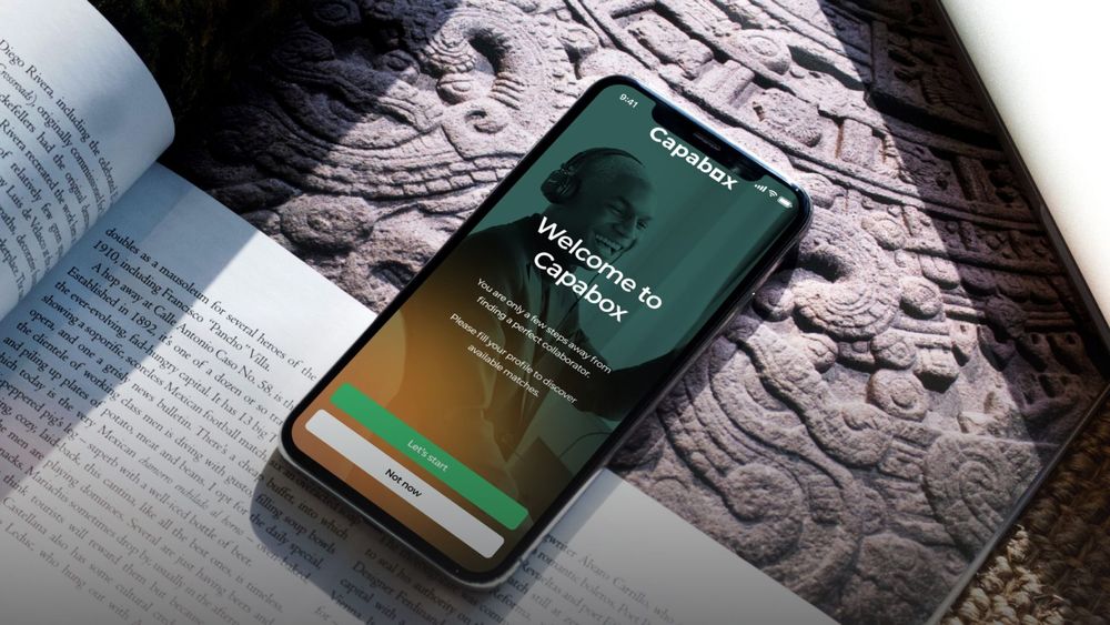
Capabox is an initiative focused on providing mentoring opportunities for people wanting to expand their skill set, get industry insights, and grow their careers in a smart way. With an innovative approach and clearly defined mission, Capabox aims to connect Mentors and Mentees from the GCC countries, and from all over the world.
Need design and development? I would certainly recommend the company.
Hero/dot was involved in almost every major step of Capabox creation. Back- and Frontend, UX and UI, even elements of strategy and marketing. I keep telling people around me that Hero/dot is one of the best at their job in Poland.Parham Gohari
Chief Executive Officer


Challenge
The main goal for Capabox was launching a fully functional mentoring platform that would make the users want to engage with it. To do that, we needed to establish a clear product strategy that was perfectly aligned with the brand’s purpose and goals. We set out to:
- Get to know the audience and the market through extended research,
- Understand the users’ needs and develop an appropriate strategy,
- Design an all-encompassing branding,
- Figure out what functionalities would best fit the objectives,
- Design and develop a universally appropriate, user-friendly platform.
Team
Development
Fronted Developer
Tech Lead
Tester
Full Stack Developer
Design
UX/UI Designer
Product Designer
Engagement
Technologies

Solution
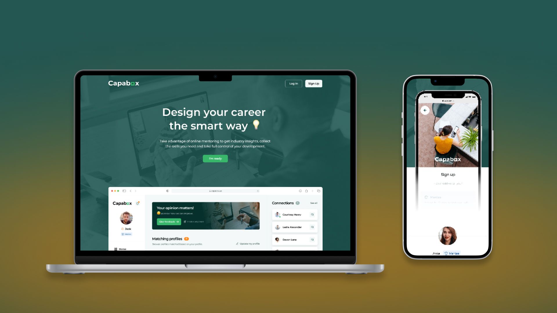
After gathering all the information, we identified a key requirement of Capabox’s new platform – connecting people through real-time conversations. With this in mind, we designed a messenger app that would allow Mentors and Mentees to exchange career advice, expert knowledge, and industry know-how. Our work included:
- lo-fi & hi-fi wireframes of the landing page and web application,
- visual identity of the brand, including logo design,
- web app and landing page development.
The visual design of Capabox’s application reflects the modern, yet friendly character of the brand itself. This duality can be seen especially in the chosen colours – cool, calming greens and warm, welcoming oranges. The combination helped us convey a sense of warmth and security within a business-oriented environment. Capabox’s final look & feel seamlessly blends with its key message – It’s never too early or too late to take charge of your career growth.
With our holistic approach, we delivered the complete digital product design
The research phase resulted in proposing tweaks to the initial concept, aiming to help our client secure business partnerships. In the end – from branding, through product design, to development – we achieved results that met all of our client’s needs.Zuzanna Bomba
Lead Engagement Designer at hero/dot


Results
The new Capabox app provides people with a welcoming environment, perfect for establishing close-to-real-life professional connections. With an instinctive design, users can easily navigate through the platform’s interface, and take full advantage of its functionalities.
We based the intuitive design on high-quality code, allowing users to comfortably navigate through the platform’s interface, and take full advantage of its functionalities. As a result, Capabox is the go-to place to look for a Mentor/Mentee based on their professional silhouette, get an accurate match, communicate with each other, and track the progress of skill-set development.
More case studies

