7 Tips To Design Better Filters

Michał Wapiński
Conversion rates might be directly influenced by the UI/UX solutions you decide to apply to filters. This is one of the things that proved to be very true when we were realizing a project for an accommodation booking platform - Noclegi.pl.
Before we started working on the solutions to improve the UX of the market-leading accommodation site in Hungary, we did both face-to-face and remote user interviews with their customers. While surveying and questioning visitors of their website and application, we discovered that filters were one of the major issues affecting users’ experience. Our designers decided to work out suitable solutions and best practices that address these problems as a part of design training.
COMMON PROBLEMS WITH FILTERS:
INCONSISTENT UI
On the one hand, having too many filters, very often imprecise, and placed in the wrong order is one of the most significant issues your company may grapple with. The incomprehensible division of filters doesn’t help as well. On the other hand, a lack of diversity of checkboxes may make your users feel tired and bored after dealing with the search on your website.
MISSING USEFUL FILTERS
Your customers might have very diversified needs. The more they vary, the more critical it is to make sure they are not left with the feeling that your design misses useful filters.
LACK OF SYSTEM STATUS
System status is inter alia the information providing how many searches your choice of filters will give. What would happen if your customer decided to choose all the relevant filters and found out no results were fulfilling the criteria? The disappointment, dissatisfaction, impatience, loss of energy to do the research again. Lack of system status may bring these feelings.
OUR RECOMMENDED SOLUTIONS:
1. PUT THE MOST IMPORTANT FILTERS ON THE TOP
Do you like scrolling in search of the filters that you need? None of us does! That is why it makes much sense to analyze which of your filters are used the most. Then, arrange them in a way that will prioritize the most important ones for your customers. It will save their time and energy; thus, creating a positive image of your company in their minds.

2. CATEGORIZE FILTERS, KEEP THE HIERARCHY OF INFORMATION, CLEARLY DIVIDE SECTIONS
Make sure your customers aren’t bombarded with thousands of filters placed one next to another in random order. Try categorizing them. While doing it, do not forget about the hierarchy of information. Those that are believed to be essential for your customers, should be placed above the others. Moreover, check if your UI design is created in a way that will allow all the users to see the divisions of filters’ sections distinctly. It will significantly facilitate the search for users on a mobile device.

3. A) DON’T SHOW TOO MUCH AT FIRST SIGHT
In this case, filter design might be compared to the first date. You shouldn’t show all your skills straight away to your potential lover. Otherwise, there is a huge probability that you will quickly become boring and predictable. The same applies to filters. Do not show all the filters you have in a given category; instead, focus on emphasizing a few that have the highest chance to be chosen.
B) BUT SHOW THE SCALE OF HOW MUCH YOU HIDE
However, remember that you need to make sure that the person you invited on a date is aware of how much you can finally offer to her, even if he or she doesn’t exactly know what it is. Therefore, in the case of filters design, you should show the scale of how much you hide in the filters’ categories. You don’t need to put the exact number of how many filters are still covered there.
“<5”, “10+”, “100+”, “500+” ⇒ such indicators should be enough for your customer to understand what challenges they face after clicking on “show more” or “show all”.

4. ARRANGE THE ELEMENTS SO THAT THEY ARE EASY TO SCAN
In the case of UI Patterns for News Cards, we explained why people prefer to scroll up and down rather than left or right. Such a layout allows your News Feed to adapt to users’ demand for quick scanning. The situation is similar when we're considering filters. It’s better to place elements vertically (meaning that each new item in the set is placed in a line below) rather than horizontally since it’s easier for our brain to gather and process information this way.

5. DIFFERENTIATE THE WAYS OF CHOOSING FILTERS
Checkboxes are usually an excellent and straightforward way to acquire knowledge about what your customers are looking for. But imagine that these customers need to go through hundreds of identical checkboxes to pick their preferences. Would it be easy and fun for them? Of course not! Therefore, try differentiating the ways of choosing filters. Apply numbers, slides, charts to enhance your UX.

6. GIVE USERS CONSTANT KNOWLEDGE OF SYSTEM STATUS
In the section of common problems, we already discussed what would happen if your customer decided to choose all the relevant filters and found out no results were fulfilling the criteria. Simply saying - colossal disappointment. Make sure to show customers whether picking filters of their choice will give them any results in your mobile application or website. Even if not, the earlier they know about it, the more willing they will be to adjust their preferences.

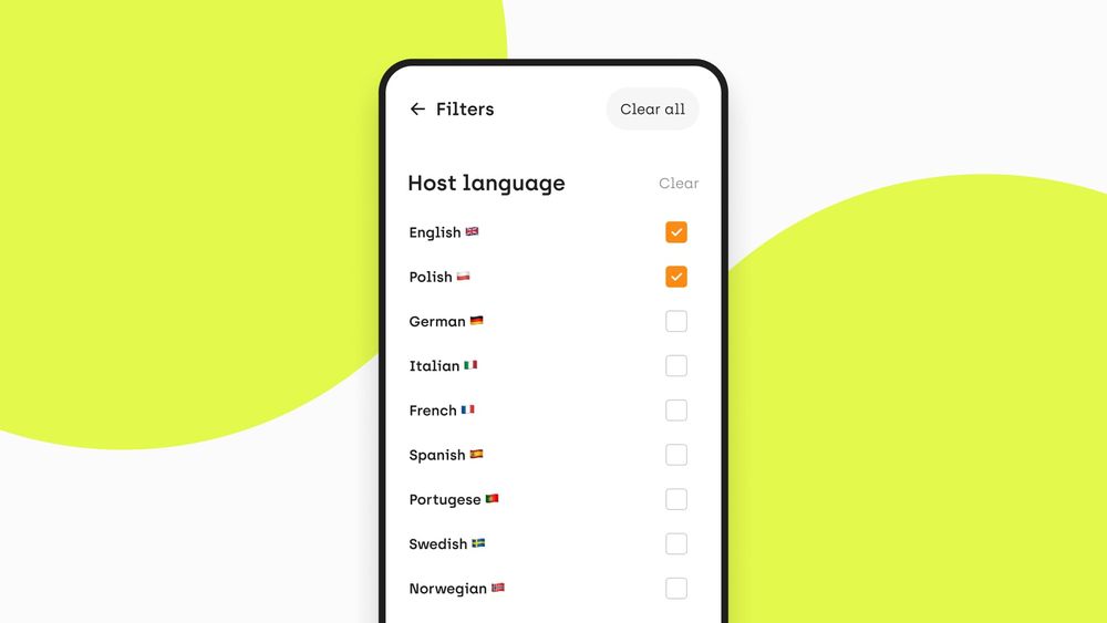
7. LET USERS CONTROL THE CHOSEN FILTERS. MAKE IT POSSIBLE TO CLEAR SECTIONS AND “CLEAR ALL”
Users tend to regularly make mistakes in choosing the filters that they’re interested in. They also very often change their mind while picking their favourable options. The knowledge about system status may influence their decisions as well. That is why we highly recommend letting users control the chosen filters. Make it possible for them to clear the particular sections that are no longer of their interest. We also recommend adding the “Clear all” button.

CONCLUSION:
Filters and categories are invaluable in excluding unnecessary items from massive search results. Well-designed filtering is the fastest way to carry your consumers to the product page. Thus, filters are essential to your conversion rates. Be as competitive as possible. Take care of your UI.
Need expert assistance with your digital project?
Recent from Michał Wapiński