7 Tips To Design Better News Cards

Michał Wapiński
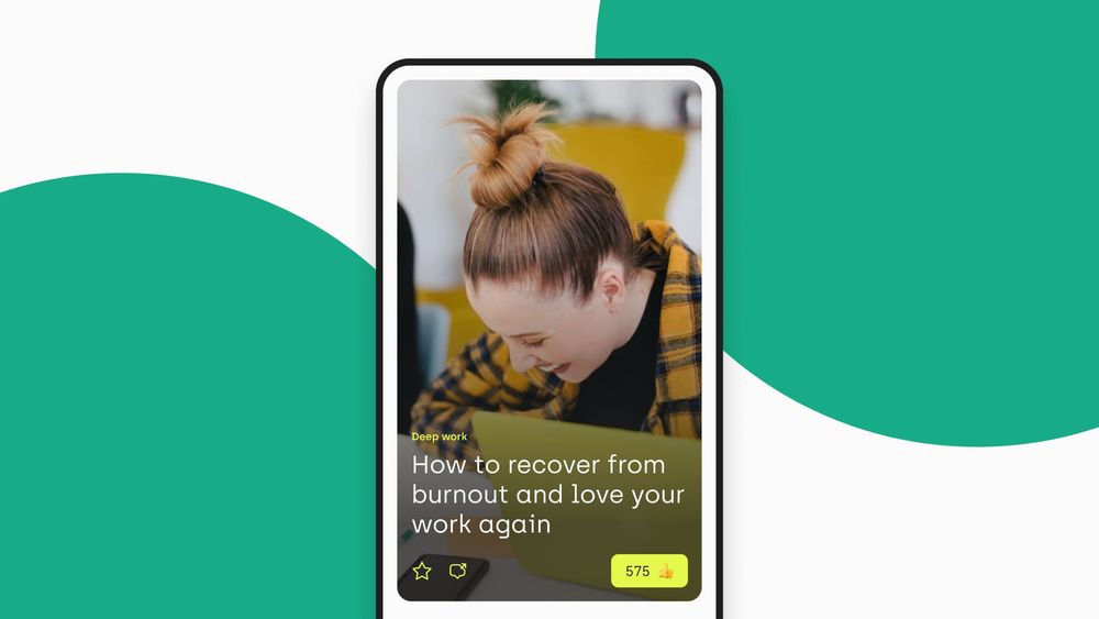
There are many ways to create easy-to-use and appealing News Cards. There’s no universal method – it all depends on design’s primary purpose and what we’re trying to achieve with it. Everyone is looking for some good UI Patterns that will allow them to create a Smart Design of the application with a smooth and nice layout.
However, everything is changing so quickly and incessantly… size of the mobile screen, length of the titles of the most eye-catching articles, colours that are preferred to be associated with specific values. Sometimes it is really tough to be up-to-date with all the new requirements that are demanded by our customers and visitors.
Recently, we designed a responsive website and a mobile app for the biggest club in Poland, Legia Warszawa. As both home feeds are intended to feature news and articles, our creative team was challenged to work out some mobile UI patterns for the news section.
In this article, we share 7 tips to design better News Cards. Here are some things to consider in order to avoid potential pitfalls:
1. TAKE CARE OF THE READABILITY OF THE ACTION BUTTONS [“LIKE”, “FAV”, “SHARE”, “SAVE”]
In order to make your users more willing to come back to your News Feed, it's pivotal to give them all the possibilities to share their emotions with the public and their friends. Therefore, you need to find some space in your design (or we can do it for you!) so that they can “like”, “fav”, “share”, or “save” the articles that you publish, without the loss of the aesthetic image. If you decide that the backgrounds of all your News Cards should consist of photos, all content placed on these Cards must be readable regardless of the picture your moderators decide to feature there.
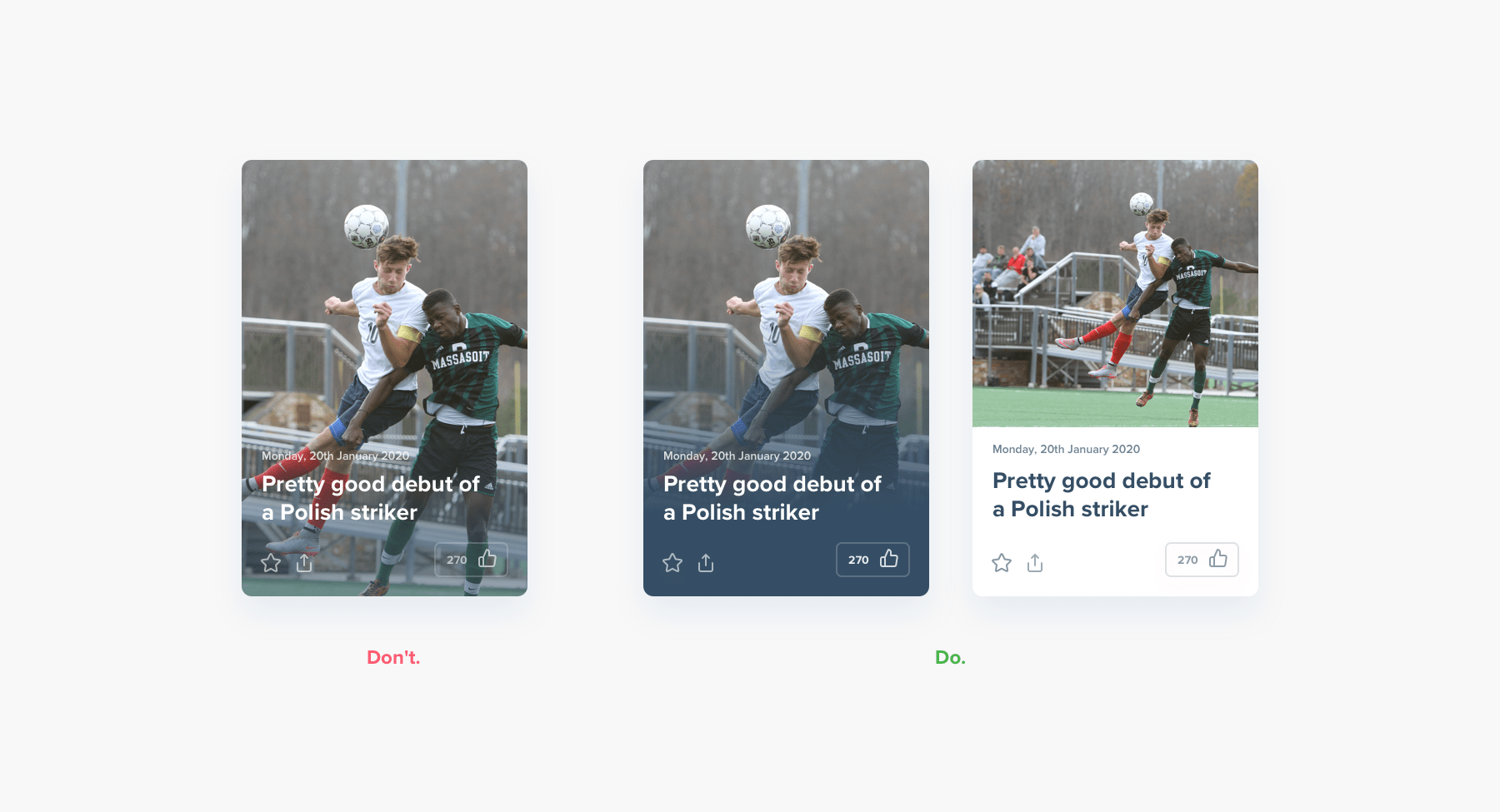
One of the best approaches you may consider is placing at the bottom of the News Card a dark gradient. The photos are sticking out there from underneath, but the text on is easily readable. The same applies to buttons and icons – if we place them on the pictures, they must have either some outline or watering.
In this way, not only will they be clearly visible to all the users of your News Cards, but also they won’t ruin the composition of the picture and the title that accompanies it. Check our proposals of how we did it for Ekstraklasa.
2. AVOID DEAD ZONE
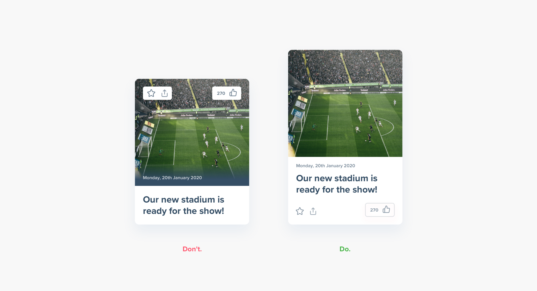
Remember about the composition of your News Feed layout. Our eyes don't like covering too much area. They also don’t like jumping from one corner to another. See the potential mistake with our example below. We also applied a contrasting solution that could make your design easy to follow.
3. CHECK IF YOUR LAYOUT IS UNIVERSAL. TAKE INTO ACCOUNT TECHNICAL LIMITATIONS
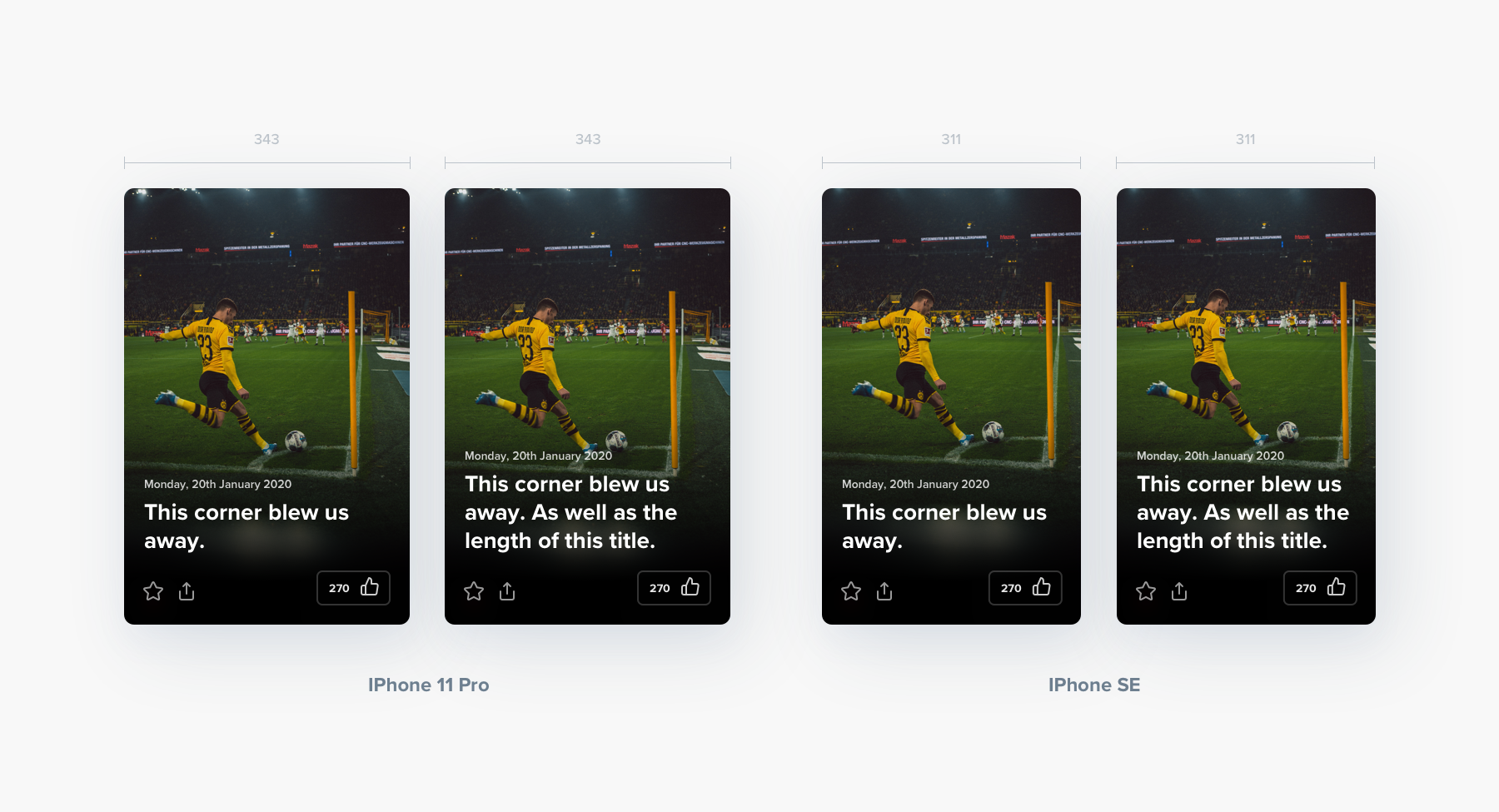
In mobile solutions, you must keep in mind the variety of screen sizes to get the best results for your News Cards. Therefore, you should consider how big your picture and how long your title or text should be so that the highest number of visitors have the same possibility to enjoy it fully. Check if your layout is universal for different backgrounds. Check if it doesn't limit your News editors too much.
A common mistake of designers is that we design something on specific photos selected by us. Then the editors put in completely different ones that no longer work with this design. For example, the title should be as concise and specific as possible. However, sometimes editors fail to do so because they don’t know what boundaries they have. Thus, it makes sense to give them a clear limit on what is the maximum number of characters they may use.
On the other hand, to give them as much space as possible, you may create a background (for instance in the form of a gradient) or prepare the self-adjusting image that will adapt to the number of lines that the authors of titles and leads need. For instance, with the use of smart layout in Sketch, your design will automatically scale up. Check how it works.
4. MAKE USERS SCROLL UP AND DOWN WHEN THEY CHECK THE MOST IMPORTANT CONTENT
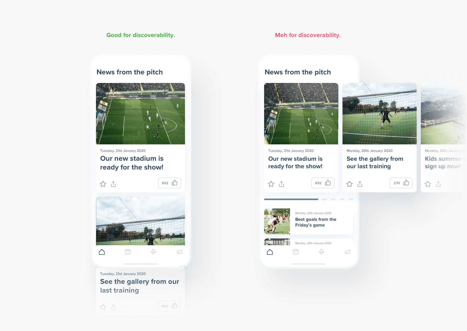
You most probably know what A/B testing is. Checking two possibilities on the research group and then, based on the results, deciding which one of them is better to use. Recent research hasshown that humans prefer to scroll up and down rather than left or right. For example, you may look at recent PSG moves that used to have different sports categorized horizontally, and now they changed to vertical after analyzing the results. Check below what is the difference.
5. CHECK IF YOU HAVE ALL THE RIGHTS TO USE THE CHOSEN FONT
The number of fonts between which you can choose increases continually. However, you should know that some of them are commercialized, and you need to pay for them to use them. The types of licenses you might get often differentiate between:
1. Desktop license - downloading to a computer and using in printing or graphics on social media.
2. Web license - use on the website.
3. Mobile license - use in the mobile application.
Make sure you have all the rights to the font you choose. Note whether you are surely licensed to use it in this particular application. It may make your company avoid paying tremendous financial punishments.
6. MAKE YOUR DESIGN AS FLEXIBLE AS POSSIBLE
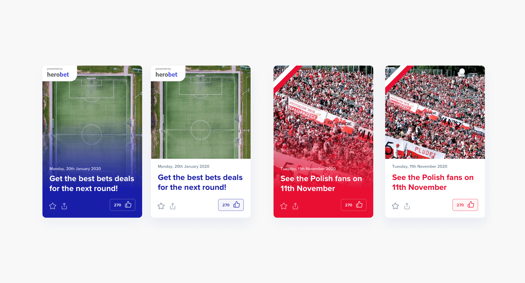
The colour of your sponsor’s logo doesn’t match the design of your News Card? Your customer wants to personalize the look of their News Cards for special days like public holidays?
Your design should be prepared for a lot, including special events or sponsored content. You can even create a design system, too. Change some minor things so that it smoothly and creatively fits your needs. What we can recommend you is changing the colour of the action buttons or the frame. Check our solutions for the connection between (made up) HeroBet and a national Independence Day in Poland.
7. DISTINGUISH YOUR ARTICLES WITH THE FORM THEY ARE PUBLISHED IN ACCORDING TO THEIR IMPORTANCE AND CONTENT
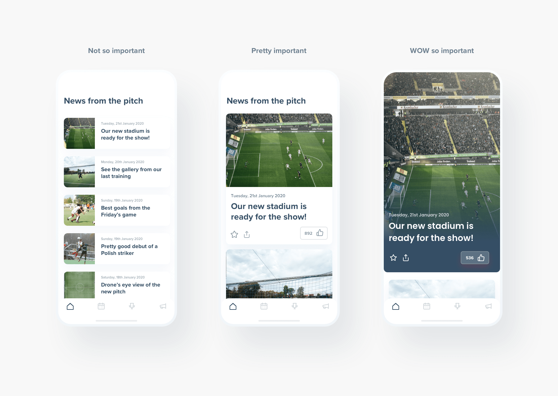
Do you think that there is only one way to design all your articles in the News Feed? No, you can slightly differentiate between them with the use of different layouts. What is most important, you won’t lose the advantages of the overall compositions if you do it smartly. How? You may put an image above the title, but you can also place it next to the text. You may show the most important news for your readers in a different way than those that don’t play such a significant role for your users or simply become outdated. Check our propositions.
CONCLUSION
Before we started working on these solutions, we benchmarked all the most prominent News Feed applications. When doing such an analysis, it’s crucial to look for benchmarks closely related to the market you are designing for. For instance, while working on the Legia case, we focused primarily on the pages of media channels and sports teams such as MSNBC, BBC, PSG, Medium. The quality of search should be appreciated above its quantity.
Need expert assistance with your digital project?
Recent from Michał Wapiński

