What is a Design System and How It Brings Order to Design Chaos

Michał Wapiński

Design has become more important for companies than ever before. Firms have understood how much advantage it gives on the competitive global market to stand out with consistent brand identity. Therefore, they’re looking for specialists who can deliver the right quality in the shortest possible time. However, the design doesn’t scale effortlessly, and lack of standards and boundaries may lead to irreversible chaos in a longer perspective.
When the number of design components is growing but the design team is unaligned, the growing inconsistency may have detrimental consequences. That’s why the majority of top-quality design teams have decided to introduce a design system as a standard for their projects.
 Audi, Netflix, Airbnb and Google use design systems.
In the future, everyone may use the concept of a design system. The question will be: who will utilise it most efficiently? Check our guide with ready-to-implement solutions to make a difference!
WHAT IS A DESIGN SYSTEM AND WHO IS IT FOR - DEFINITION AND BENEFICIARIES
Design system is a single source of truth that allows the whole team to design and develop a product. It’s a language created for digital projects that facilitates the creation of consistent experiences for the end-user. It provides designers, developers, and product owners with a broad-ranging and comprehensive compendium containing instructions, guidelines, and best practices on the way of preparing design at every stage of the process.
It’s a set of deliverables containing both tangible and intangible elements. On the one hand, it gives access to a group of reusable tools and frameworks that designers and developers can use to build digital products in less time. On the other hand, it should include the values and beliefs that a brand wants to share with an emphasis on the company’s mindset.
Design system is definitely more than any other process that we know. Actually, it’s made out of specific components of other popular methods such as style guide or pattern library. An excellent design system should include not only the “bricks” with aesthetical elements of a product and set of symbols and assets but also frameworks, specific guidelines, and best practices to help create consistent UX across all the platforms.
The collection of reusable, integrated components accompanied by clear rules and examples of practical applications, is the best way to build any number of products or applications with a compatible identity.
WHY YOU SHOULD INTRODUCE A DESIGN SYSTEM - ADVANTAGES
- Save resources, be consistent
A well-prepared design system enables your company to save resources by making the design reusable and scalable so shortening the time of preparing new projects for the same brand. The system's greatest value is the combination of coherent visual communication with technical documentation used by programmers, managers, designers, copywriters and other specialists responsible for building customer experience. It’s a leading factor in making your product team consistent in creating solutions no matter how many people work on it. It also directly contributes to the acceleration of work on subsequent products and services.
- Make new employees efficient from the very first day
Another advantage that a design system brings is a faster implementation of new employees. It refers primarily to specialists such as graphic designers and programmers who have clear guidelines and the necessary information from the very beginning of their journey in a new environment.
- Better your UX, get higher conversion rates
By being compatible with your values in the form of design, you’ll be able to provide your customers with overall better user experience. It will positively impact your conversion rates which will automatically go up as you will offer more appealing service than your competition. Moreover, by saving resources such as employees’ time, you’ll be able to dedicate more efforts on preparing and testing your other projects; thus, improving them, which also will have a beneficial influence on the relationship with your customers.
- Improve company’s communication and order
Once you introduce a design system, everyone in your company will have access to a database where they can see and check all the necessary knowledge about the brand ranging from design up to communication. This ease in finding information will lead to a greater sense of order and control among your colleagues. Moreover, it will facilitate the interaction between different teams in your company. All the changes in the design process will be automatically updated in the common folders and documents.
WHAT SHOULD A GREAT DESIGN SYSTEM INCLUDE - BEST IDEAS
- Style Guide
First of all, you need to map out your current value model to decide what style best fits your design. Think of the value proposition which stands for a summary of how your product or service benefits your customers. You may also consider using the idea of look & feel, which is a design process that stands for displaying a visual representation of the image that your brand will have. Once you do it, you will know what you should keep in mind when preparing a style guide for your design system.
 Colour Palette
 Shadows
 Typography
![]() Icons
Icons
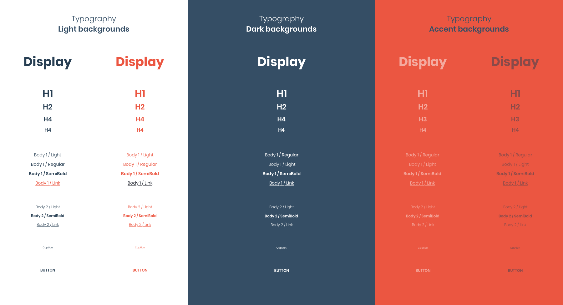
It’s a part of your design system that should be less flexible and changeable over time. Nevertheless, remember to prepare various ways of showing the same values in your design. The elements that should be included in the “style guide” are:
- Colour Palette,
- Shadows,
- Fonts,
- Typography,
- Icons,
- Symbols,
- Illustrations and Photos,
- Shapes.
- Design components
Prepare specific elements that can be used both by web and mobile applications designers, as well as marketers. The greater the variety of options you’ll prepare, the lower the chance of inconsistency in their usage in the future. Of course, on the one hand, you need to believe your colleagues and specialists from other companies and give them space to adjust their ideas to the market demands and requirements. On the other hand, the earlier you prepare, the higher number of specific solutions, and the easier it will be to stay consistent and fulfill the long-term branding strategy.
 Sliders
 Light Background Buttons
 Dark Background Buttons
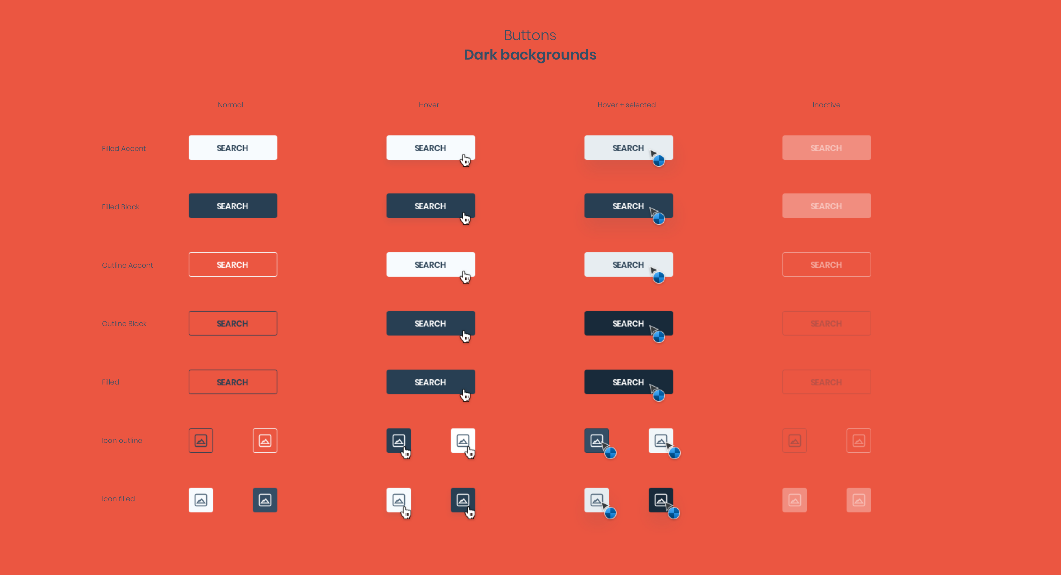 Accent Background Buttons
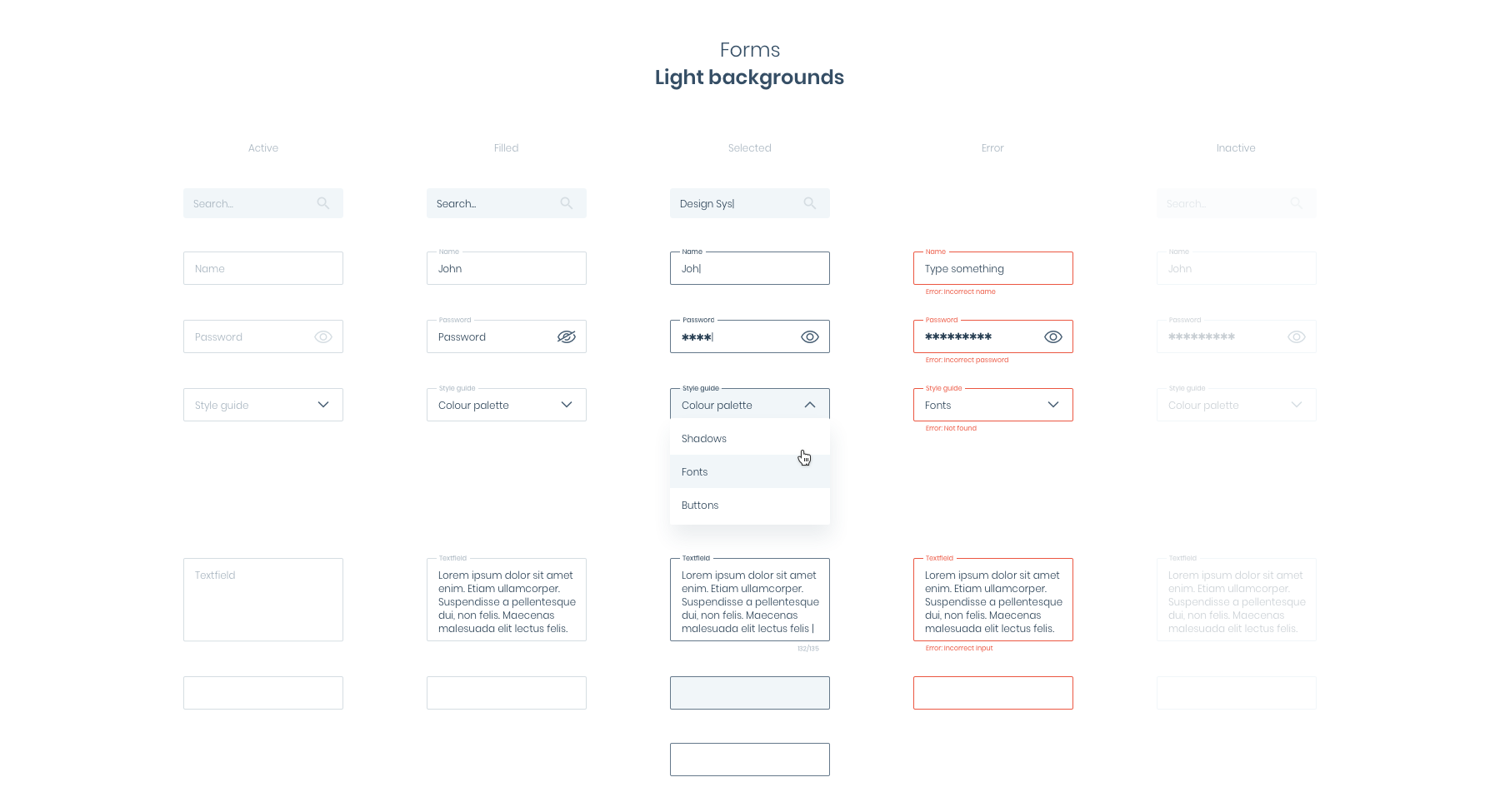 Light Background Forms
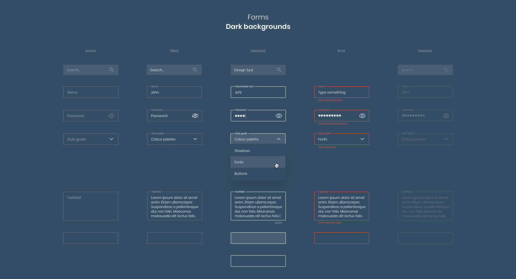 Dark Background Forms
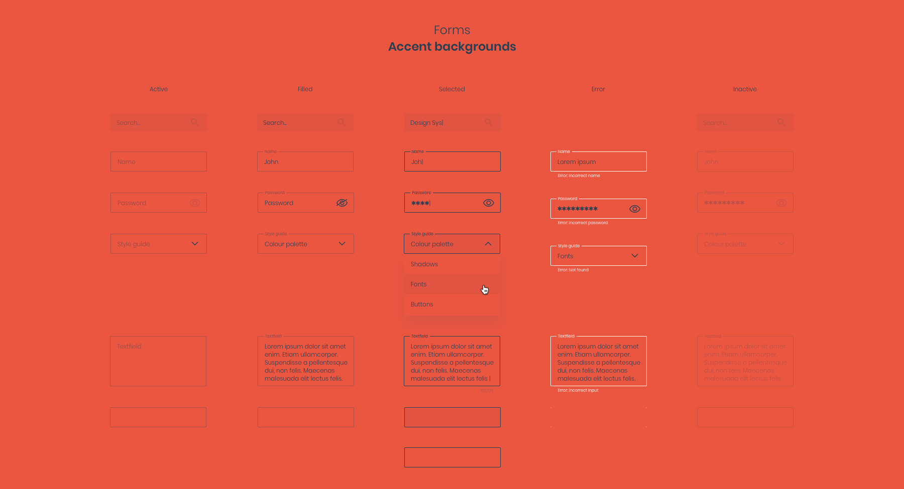 Accent Background Forms
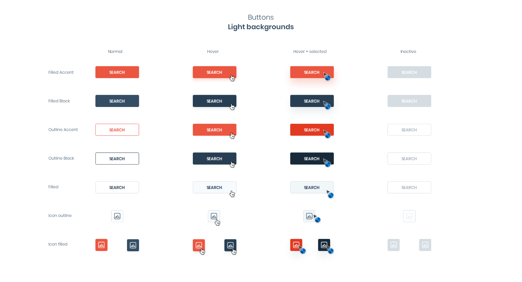
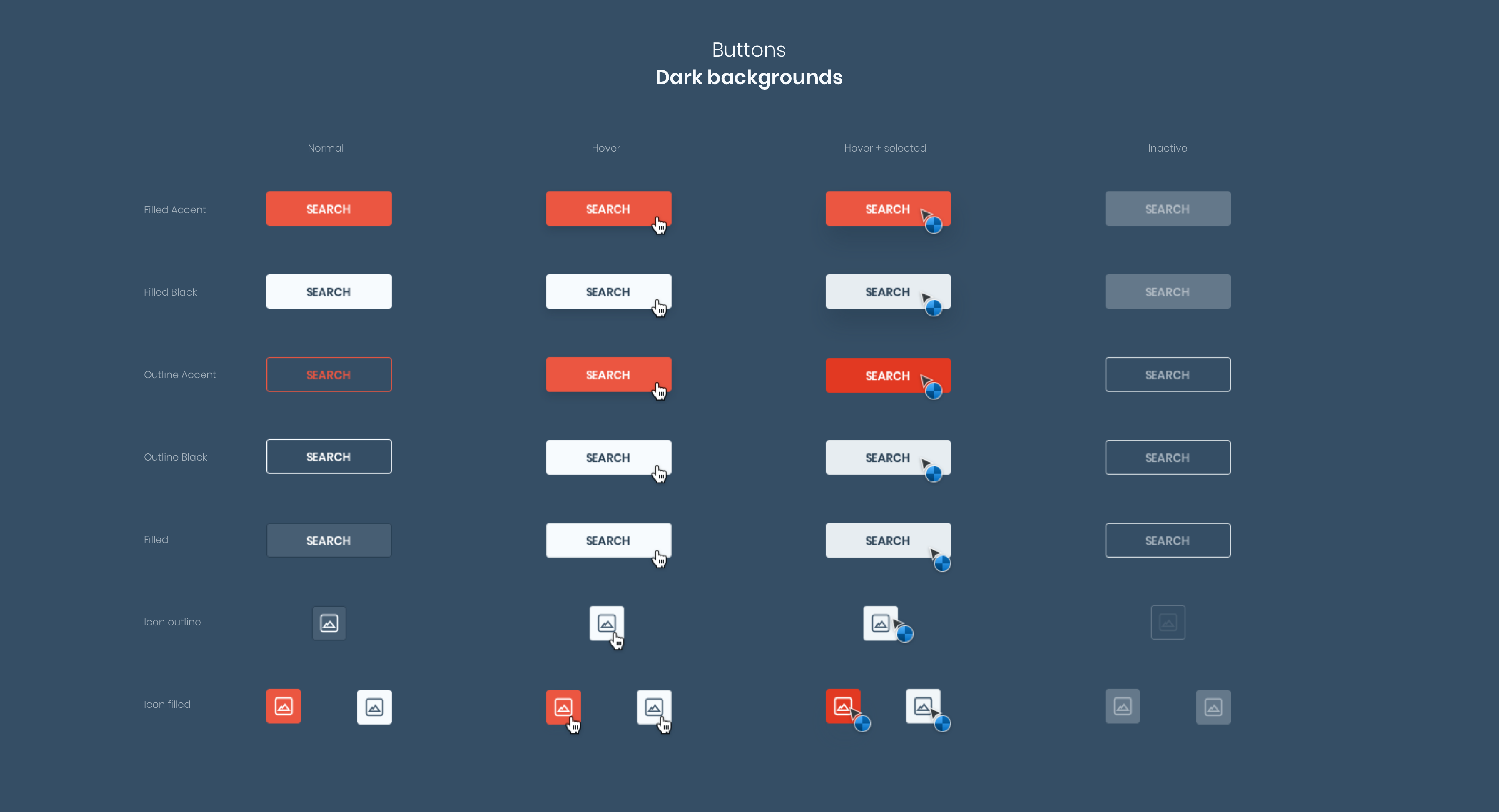
It’s a part of your design system that may tremendously expand over time without losing its quality as long as new ideas fulfill the rules set by the style guide, and editorial guidelines are met. The elements that should be included in the “design components” are:
- Buttons,
- Sliders,
- Menu,
- Navigation,
- Breadcrumbs,
- Pages,
- Spaces,
- Text fields,
- Modules.
- Editorial Guidelines
Do you remember when we talked about the values that your company wants to represent? Editorial guidelines are essential for your product and marketing teams to express them so firmly that they remain forever in the customers’ minds. Here you need to prepare the so-called tone of voice. Depending on how you approach your brand identity, your tone of expression, the perceived power of your communication, and the compatibility of your messages will be differently received.
It’s a part of your design system that might expand over time, especially if you implement a lot of new ideas and products. Nonetheless, the primary rule here should be: once anything is added to editorial guidelines, it should be impossible to be changed. The elements that should be included in the “editorial guidelines” are:
- Voice and Tone,
- Sounds,
- Words,
- Capitalizations.
- Pattern Library
Don’t forget to prepare a graphic library containing specific examples of the interface and practical advice on how to use them, e.g. forms appearing on the website along with examples of their use. A pattern library is a collection of user interface design elements. To some extent, it should be a combination of “style guide” and “design components” mixed and extended. It may constitute an answer to recurring challenges that solve common design problems.
The vital part of the pattern library is that the extended design system will contain here the specific examples of coding that might be later used by developers. It will strongly facilitate their life. The elements that might be included in the “pattern library” are:
- Code,
- Animations,
- Slideshows,
- Social Media features,
- Business and User Flows.
- Best Practices
To be certain that your design system is adequate and easy-to-use, it should consist of contexts in which your brand indeed appears. If you run campaigns on physical media, it should show specifically what your outdoor advertising will look like. Analogically, if you're advertising digitally, it should give you the feel of your social media campaigns and website. In this way, you’ll be able to check how your future design adapts to the changes in the surroundings.
“Best practices” has a vital role from a design system perspective as it visibly and explicitly shows how a given branding is applicable to different platforms, environments, and products. It allows you to visualize what the brand identity will realistically look like in the future. It maximises the effectiveness of designers’ work by setting the right Art Direction and showing specific examples.
It’s a part of your design system that may massively expand as time passes, especially if you regularly implement new projects. The elements that can be included in the “best practices” are:
- Templates,
- Presentations,
- Documentation,
- Billboards,
- Posters,
- Advertisements,
- Murals,
- Business cards and badges.
HOW TO PREPARE YOUR DESIGN SYSTEM - BEST CREATION TIPS
We’ve already mentioned some of the creation tips above. Still, as it’s crucial in understanding the idea of a design system, we’d like to order the most important points chronologically so that your work is facilitated. When creating a design system, remember to define:
- Purpose, Target and Values
Before starting working on a design system, it’s vital to align teams around a clear set of shared goals and values. In order to do it efficiently, it may make sense to redefine or restate your company’s mission similarly as in the process of adapting the business to a new reality. Map out your current value model by defining your value proposition, target group, ways of value distribution, and revenue model.
It will help you to build a common vision and make sure that people preparing your design system look in the same direction. Naturally, you need to be ready to adjust to evolving goals flexibly but make sure it’s broadly communicated. The values that you choose are like ideals that will guide your decisions in making design compatible with your key objectives.
- Look & feel and design principles
Once you define your values and target group, prepare templates of what some of your solutions will look like in reality so that you can consciously decide whether it’s a direction that is satisfactory for you. Look & feel is a brand identity design process that allows you to prototype how the consumers of your products will perceive your design choices and how they will feel when interacting with your brand. It’s a smooth “creative direction”, which shows the general course that your brand will take.
The moment you are sure about it, it’s essential to define design principles. They are much more than just the visual aspect of a product. Design principles are the guiding sentences that help the teams to reach the purpose of the product thanks to the design. By preparing them, you’ll facilitate your team to make the right design decisions. They’ll also constitute a clear boundary for designers that can’t be crossed.
- Governance Strategy and Culture of Communication
The way you organise your design system will have a direct impact on its evolution and scalability. You should adjust it to your personalised needs. The more your company cooperates with experienced specialists, the less there’s the need to check and control them. Nonetheless, you should still decide what you want to achieve with that. We differentiate between two models of design systems.
If you prefer one person who manages the design system, it means that you want to introduce a centralized model. Such an individual needs to be close to various people in various positions. Only then can he understand the different perspectives of people forming your brand and be sure that the design system meets all of their needs.
The other possibility is having a greater number of people from many teams who will be in charge of the design system. In this distributed model, the adaptation of the system is quicker, and its use is more extensive as everyone feels involved in it. However, it also needs more leaders who will be able to cooperate. Whichever model you choose, we strongly recommend you allow everyone to participate in the creation of a design system at least by making suggestions as it creates a powerful sense of membership.
- Balance between strictness and flexibility
Even though design systems have mainly multiple advantages, they also have one significant threat. There’s a risk of falling into the framework of doing the same designs over and over again, instead of constantly creatively searching for the best solutions. Depending on your team’s abilities, you should decide on the balance between strictness and flexibility of your design system.
If you want to have comprehensive and detailed documentation fully synchronized between design and development, you should turn towards a strict system. It will have clearly stated rules on introducing new patterns and changing anything in the design system. Remember that it should also lead to a broader concept of a design system to be able to cover all the cases that your brand will encounter.
If you prefer to leave more space to your colleagues or business partners for experimentation with designs, you should think of a slack system. This method gives more freedom to designers and developers in using specific components of a design system. The bricks that are placed there don’t have such strict and regular connections. Nonetheless, in the majority of cases, your choice will be somewhere between the fully strict or slack system.
CONCLUSION:
Design system development is a gradual process that can take time, especially at the beginning of its creation. However, this initial investment will help you avoid a super-consuming mess along the way and create a sustainable design process. Design systems have the power to transform a typical organization into a robust product design force.
Thanks to them, you can react more effectively to changes and focus on building the best experience of your customers. The idea of design systems is focused on team collaboration in creating a brand’s image. It played a vital role in making design systems a trend that is already implemented in many projects around the world.
A successful design system will become a part of your team DNA, helping you to produce more consistent user experiences, building bridges between design and development, and improving your design process. It’s time for you to implement a design system in your company’s projects. Let’s do it with our help!
Need expert assistance with your digital project?
Recent from Michał Wapiński


