How To Design a One Page Website – The Strategy Behind It
Zuzanna Bomba

Designing a one page website is all about strategy. When there's limited space, every choice you make matters. We're here to reveal the process behind it, explain a one pager structure, give out our best tips and tricks. So warm up your thumbs and scroll down to learn how to convey your business objectives with minimal copywriting.
The 4-Step Process Of a One Page Website Design
Step 1. Workshops
One page website design requires a strategic approach to reach (and exceed) the client’s goal – business-, marketing- and image-wise. We can’t stress enough how important it is to get them right. If you have very little information about the project, you are clinging to the limited data you have. So let's broaden your perspective, shall we? Discuss the goals during workshops with your client, ask specific questions, and call for precise answers.
Step 2. Research
Before you ever touch the wireframes, focus on understanding the user. Who are they? What do they want and need? Fork out the pain points and analyze what truly speaks to your target audience. Empathize with them and bring out the real value of the product or service.
Step 3. Engagement Design And Content Strategy
Why is hero/dot’s approach different from the “regular IT” process? We put more emphasis on Engagement Design. Both workshops, research, content strategy, and pre-lo-fi wireframes are typically delivered by the same person. This holistic vision and deep understanding bring incredible value to the project.
The content structure (or pre-lo-fi) wireframes are sketched out by Engagement Strategists in Miro and serve as a point of reference for UX Designers. It’s like a puzzle: start with a frame and then, fill it in. And that’s the power of our teamwork! We always put the pieces together, faster and more efficiently than any of us could do on our own.
But before we move on to discussing this next step (you’ve seen the table of contents, right?), let’s talk about two main functions of a scrolling page:
- The informative function — a one page website introduces a company, a product (service), or a concept. It explains what’s going on in an interesting way. Simple as that.
- The persuasive function – converts this interest into real-life action. If you add real-life benefits and values for the user (both rational and emotional), they will be more than willing to click on a CTA.
What’s a CTA button? It’s a call to action that helps you fulfill the purpose of your one page website – and it can come in all shapes and forms. For example, if you want your users to download an app, you use some sort of “Download now” variation. If you aim at collecting leads for a newsletter or notification, your button can send the user to a contact form. Identifying the goal is key. Without specifics, achieving it is elusive.
Step 5. The Lo-fi and Hi-fi Design
If you’ve read our glossary, you probably know what these are. While the lo-fi wireframe is basically a setup for your website, the hi-fi one mimics the look and feel of your one page website. They are usually clickable, which means that we get a full picture of the user's experience. The aesthetics and precision are equally important when it comes to defining the graphics, layout, and spacing.
With a pre-lo-fi structure executed by a player of our creative team, UX/UI Designers are able to focus on the platform’s visual identity and functionalities. At the same time, Engagement Strategists keep a pulse on the effectiveness of communication. So yeah, we cooperate, offering mutual feedback, insights and – sometimes – critique. The end result is always a product of the team effort.
Afterwards, it’s high time for the Product Designer to step in. With a simple one pager – where there's only one CTA – they aren’t as involved in the process. However, if the project is more complex, delivery requires more time and effort. Obviously.
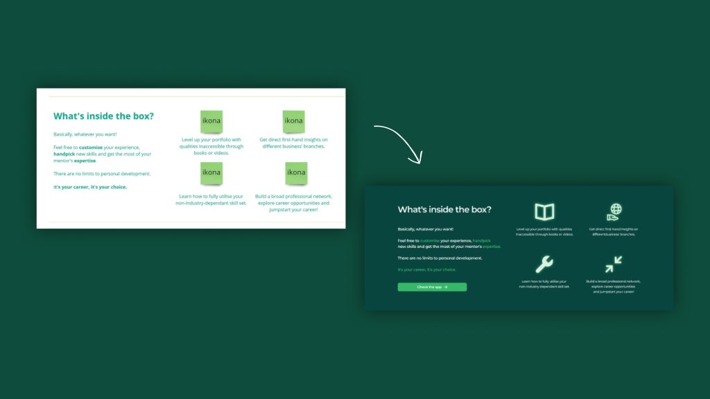 Whether we go for a complex website or a simple landing page, our team takes it one step at a time. The pre-lo-fi wireframe is usually designed in Miro by Engagement Strategists who come up with the structure of a website, plan out the content and deliver copywriting. In the next step, UX Designers shape its final form. We always sketch our websites out and then… add some color!
#1 Problem & Solution. My One Pager Doesn't Work.
I'm disappointed. The one pager didn’t achieve the expected goals. What went wrong?
Solution: Okay, someone here didn't analyse the situation well, huh? Two things could have gone wrong. Either you misidentified the goal, or the overtone of the messages didn't reach the audience.
1) What's the goal? A 'business card page' with no CTA behind it generates fewer conversions. Having a button to click is a must, no matter if it’s “Contact us”, “Sign up” or “Download now”. It should stand out, be easily locatable, and always handy. Make sure you meet these criteria to design a great conversion landing page.
2) Who's your target audience? If there’s no issue with CTA whatsoever, it means that you messed up the persuasive part. Go back to your user’s needs and wants, make sure to highlight the benefits of taking an action. Focus on a sharp, witty narrative. That should fix the problem.
How To Design a One Page Website? Nail the Structure.
Hero
Who’s the main protagonist of your one-pager – a Black Panther, or a Punisher type? Wait… you don’t know who’s Punisher? That’s exactly our point. You’re aiming for a blockbuster, not a rotten tomato. Hero is the hottest spot on your heatmap, the first viewport once the one-pager is loaded. Now you have some 2.6 seconds to grab their attention and persuade them to scroll down. Your hero is a statement. Make it strong.
How to do it? With copywriting and graphic design. Hero has a clear structure: it consists of a heading (claim), subheading (two-three lines of copywriting with benefits for the user) and a CTA (call-to-action) button. Showstopping writing always communicates core values and highlights benefits for the client. It has to be short, crisp and on point. Beautifully executed design only adds to that, displaying content and being a statement of its own.
Oh, and always keep the goal in mind. The CTA button has to stand out, be easily locatable, and say “click me”. Just like these cookies and bottles in “Alice in Wonderland”.
 This is the first viewport – or a hero – of Capabox's landing page. It consists of a heading (claim), subheading (benefits for the user) and a CTA button ('I'm in' equals 'Sign up' here). Fun fact: Capabox was initially going to be a one pager. However, this vision changed as our client expanded their business objectives. And it's more than okay.
Content Sections
Alright, so your hero captivated the user’s attention and now they’re scrolling down. Great job! You are no longer restricted by the narrowness of the first viewport. Now let’s get your UVP (unique value proposition) shine.
What’s a UVP? It’s a set of values for the user that comes from a deep understanding of who they are and what they want. Research, remember? Your potential customer is looking for benefits for themselves. So keep in mind: it’s not about you. Avoid saying “we”, “us”, “our”. It’s all about them. Your product or service is designed for the client. Period.
The structure has to be logical, precise, and well-thought-through. Remember: the lower on the page, the colder it gets. Don’t save the best for the last and make your one page website easy to navigate. How to do it? With no-brainer headlines that accurately describe the content. That’s the harsh truth. Sometimes you need to sacrifice wordplays or puns for the sake of great UX.
And, most importantly, always keep the goal in mind (how many times did I mention it to this point?). At the early stages of your project, you figured out what’s the main goal, now’s high the time for conversion. Intersperse CTAs in consecutive sections – by duplicating the buttons, you maximise the chance that the user will click on them. That’s no rocket science. If one pager contains more than one feature, analyse which one is more important (e.g. downloading an app is more important than signing up for a newsletter) and make it more visible.
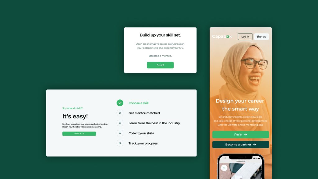 Use CTA buttons wherever you can (but don't be pushy). It should be easily trackable, always handy and paired with benefits for your user.
Bottom Sections
Okay, so your user reached the very bottom of your one page website. It’s so cold, they’re basically having a Syberia experience. If your user made it all the way here, it means you still haven't convinced them. You probably messed it up somewhere – but no damaged goods. Yet. It’s the last call to bring up the CTA... again.
They are two types of persuasion gears: rational and emotional. At first, we tend to focus on tangible benefits supported by measurable arguments, like quantitive data (i.e. number of downloads), social proof (i.e. recommendations) or quality assurance (i.e. all of the 5-star ratings). Of course, they are always wrapped in a compelling narrative and storytelling. This straightforward approach hardly ever works, though. Why? Because people are driven first and foremost, by emotions.
So don’t just state things. Don’t merely use facts. Think about the emotional value for your user. Empathise with them. How will this product or service improve their well-being? What’s their intrinsic motivation to do the action? Answer these questions and appeal to them. Then, add the CTA. See how it clicks now.
Footer
And now to the boring stuff. Footer. That’s the place for all legal issues, like Terms & Conditions, Privacy & Cookies Policy, Disclaimers... and they’re usually lengthy, right? There's no way to add them to your scrolling website. Or isn't there? We can think of at least three solutions to this problem:
- They can be displayed in a pop-up this solution is yucky when it comes to mobile due to issues with the responsivity.
- The link directs you to a pdf that is displayed in a separate tab.
- When we click on Terms & Conditions we display them on a subpage - this is acceptable in the one-pager convention.
Oh wait, so some stuff can be displayed in subpages? Yup, it’s still a one-pager. But... why?
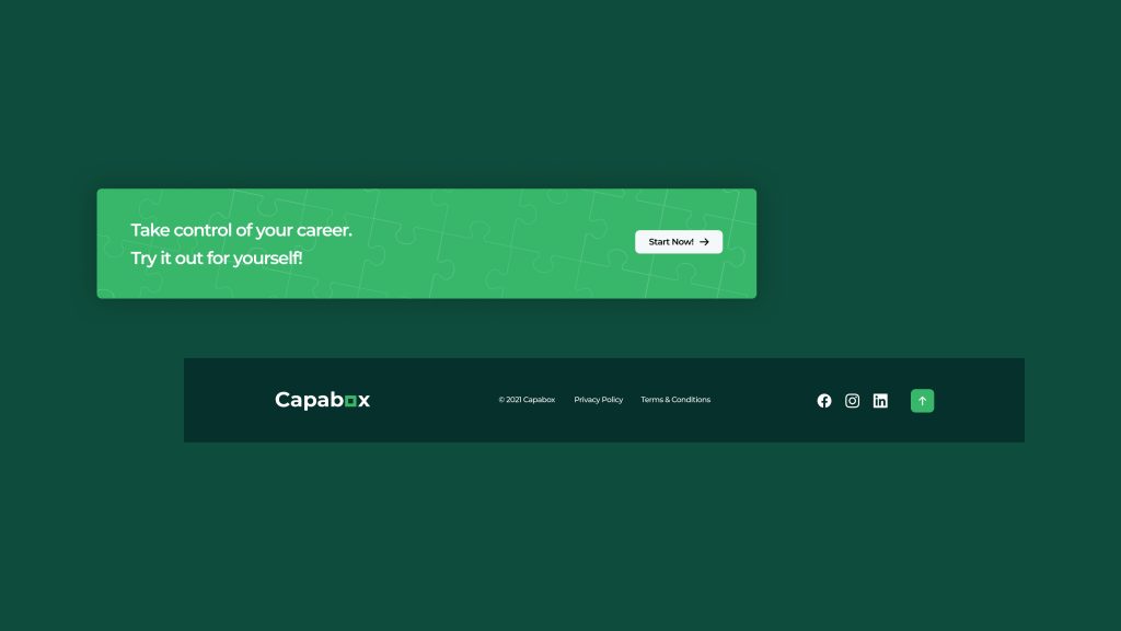 These are the two last sections of Capabox's landing page. The 'last call CTA' is always paired with a benefit for the user. This time, it's an emotional one: take charge of your career, empower yourself. Below you can see a footer – the go-to section for stuffing in all legal information, displaying social media and placing a 'scroll up' button.
#2 Problem& Solution: My One Pager Takes Ages to Scroll Through.
The one page website design is okay on desktop but lengthy on mobile. Honestly, my thumb hurts as I scroll to the bottom.
Solution: One page website design differs slightly on desktop and mobile versions – both need to be easily scrollable. In the web version, it is easier to arrange the space, because there is simply more of it (the screen is wider, duh). But! A well-organized space is easier to navigate. Here’s what to do:
- Gather the most important elements of the page (How it works, About us, Contact) and place them at the top, in the top navigation bar. Instead of taking us to other pages (as with pages that are not one-pagers), clicking on them will automatically scroll us down.
- Longer sections can hide under the “Show me more” button. Display key info above it and provide a value for learning more.
- Place a button at the footer that will take us to the top.
- Oh, and the CTA must always be easily trackable. Always keep the goal in mind.
Why Is 'The One Page Website' Definition Troublesome?
Paradoxically enough, a one page website design can consist of several subpages that are not the main page. In this case, we mark content on a page that pretends to be a subpage in the link tree. This is a deliberate procedure to avoid dissonance on the user's side.
So, a scrolling website defies easy definition. The concept of a one-pager differs between designers and developers. Technically, it is possible to have a one-pager that navigates us through various links on the platform. For the developer, it will still be technically a one-pager, but for us, in terms of design and content, it won’t be. Why? Because we have to design each page separately.
Wait, it gets even more complicated. If you introduce a tab in the top navigation bar that directs to a subpage with details – it is no longer a one-pager. It's a regular website with subpages. However, rather than diving into the tech-based details, think about your scrolling page as a coherent whole. If you are unable to fit all your content into a homepage and create subpages, it’s not a one-pager.
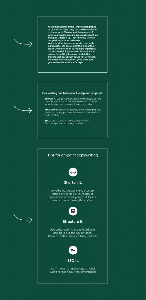 If there's too much content on your one pager and you're unable to fit it in, try shortening it up. Increase readability with bullet points or add some more structure with eye-catching icons. And remember, your copywriting is never created in vain. The goal is to improve its SEO performance. See? It's a game-changer.
#3 Problem & Solution. There's Too Much Content On My One Pager.
There’s an overwhelming amount of content on my one pager. How do I stuff it all in?
Solution: Well… you don’t. You make the decision to design a one-pager when there’s limited content that you can logically break down into concise sections. If you forget this overarching premise and overload the site with content, it's a signal that you've missed the mark designing the project’s roadmap. Think again about whether this should be a one-pager. UX-wise it’s better to distribute this overwhelming amount of content on several subpages.
Conclusion
One page website design is not as easy as it may seem. You need to be precise with your choices. Never hesitate to cross out what seems in any way irrelevant. However, it’s also a great solution for those who want to have an online business card, launch your product (solution), or start a new project with a bang.
With our tips in mind, you certainly can get it right. Now you know how to avoid some pitfalls, right? That’s a great start!
And remember. Always. Focus. On. The. Goal.
Need expert assistance with your digital project?
You may also like
