eForest Web App & Brand Identity Design
Mania Dąbrowska
eForest is a newly launched web app by BZB UAS, a Polish start-up with whom we have previously worked on their Planner app. This time we set out to design brand identity of their new product and make sure its unique functionalities were properly communicated to future users.
The Project
Working in IT provides us with a unique opportunity of collaborating with a great variety of businesses. So when our client invited us into the world of forestry – which is quite a niche industry – we gladly jumped on board. Or, shall we say, walked deep into the woods.
eForest combines drone surveillance with AI solutions and carefully developed algorithms. Its users are then able to optimise their forest care and make faster, more precise decisions.
With this unique value proposition already drawn up by BZB UAS, our main goal was to design the best possible communication of the web app. We delved into benchmarking and, as per usual, set out to achieve tangible user engagement.
The Process
Discarded Design
Designing a web app dedicated to foresters, we immediately thought of picturesque views of seemingly endless forests and their slightly gloomy feel.
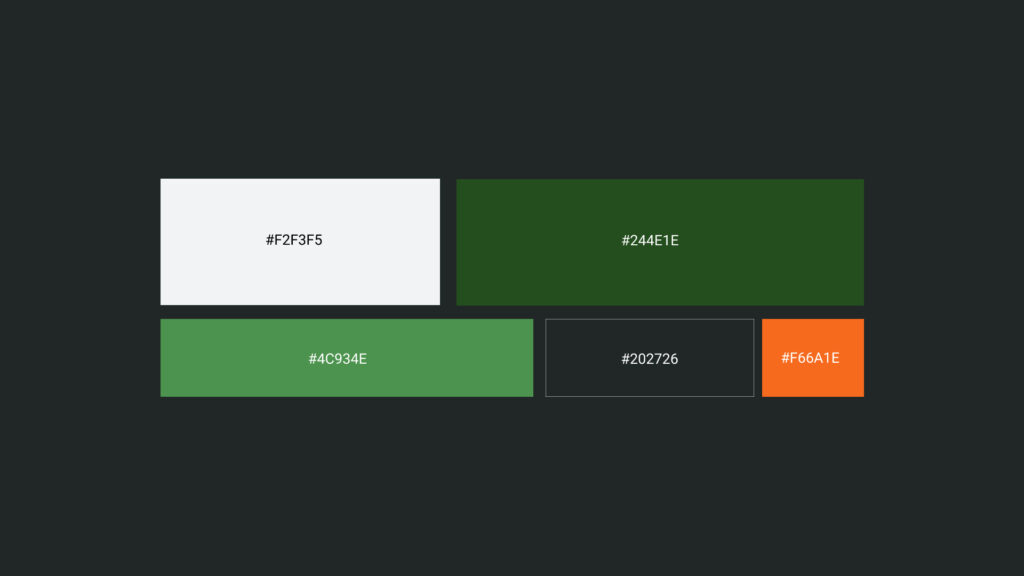
We leaned towards the cosy, vibrant green of the trees and dim colours of the shadows they cast. The addition of a bright, warm orange hue serves as an accent and lightens up the mood. With this colour we wanted to evoke the image of autumn leaves, fragrant resin, and tree bark basking in the warm sun.
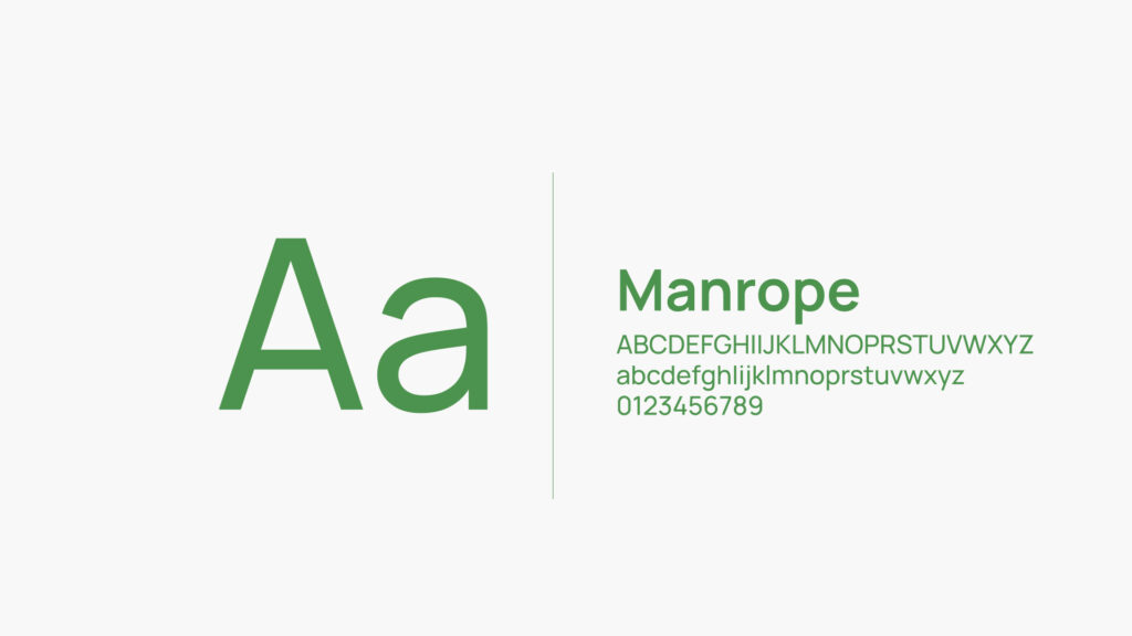 The initial typeface we used for the eForest web app
 At first we went with a rather traditional colour palette and added a bright orange hue to lighten the mood
 The discarded look of eForest was visually pleasing, but not modern enough
However, after creating first visualisations, we simply didn’t feel as satisfied as we’d like to. And so we set out to find a better solution.
Designing Logos
During the process of designing visual identity of a product, understanding its future users is essential. In this case, with foresters as the target group, their primary goal is to take perfect care of the forest they’re managing.
With the first logo design, we tried to convey a picture of a balanced, sustainable forest. We achieved that by toying with the idea of a firmly rooted tree, cradled by the surrounding soil. But we also needed a logo that would be easily implemented throughout the entire product, so we decided to try a different approach.
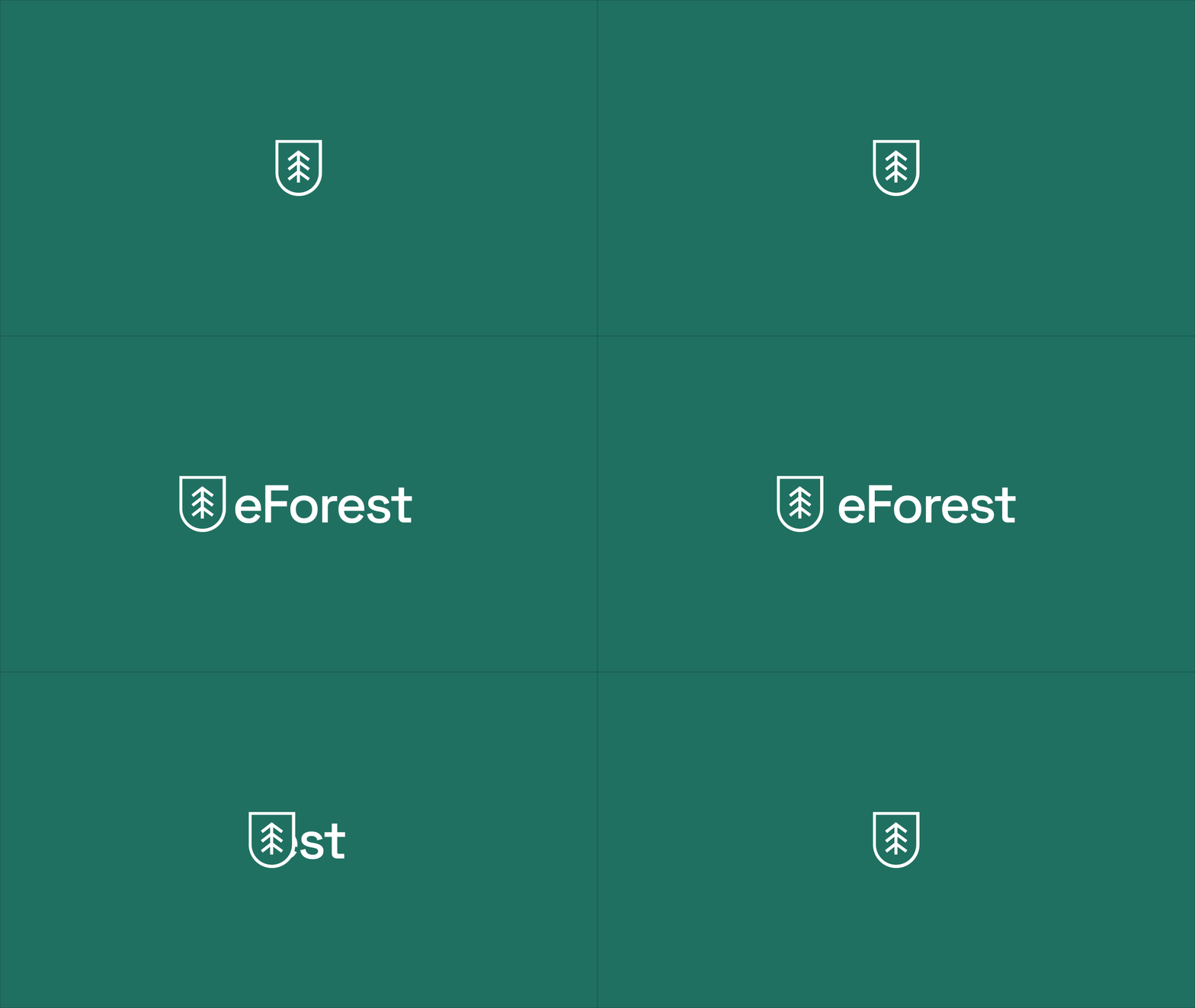
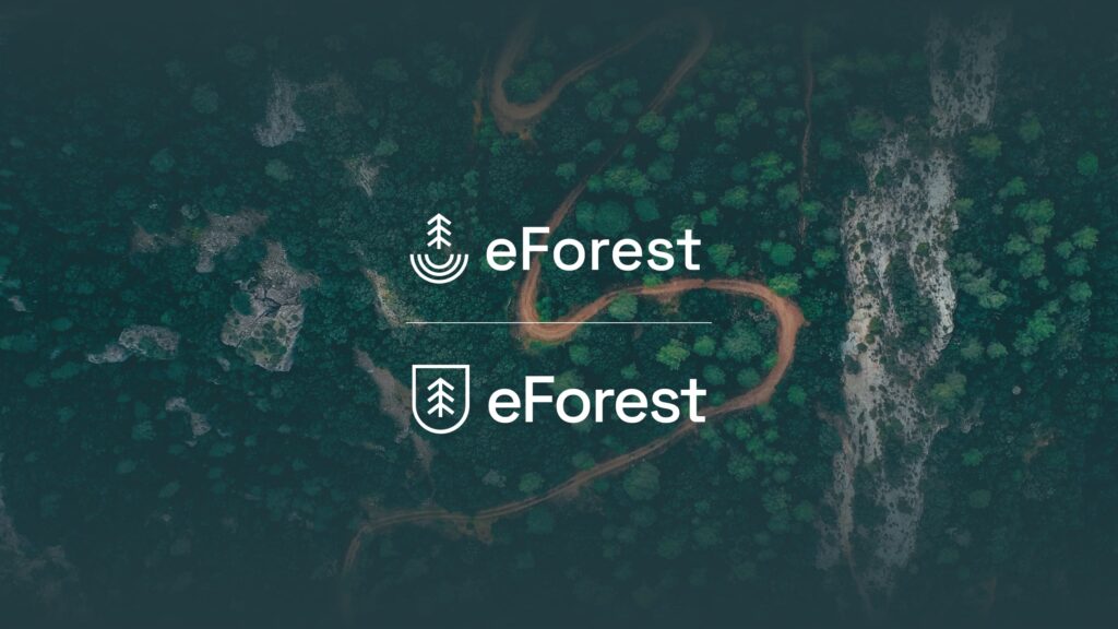 The chosen logo design (on the bottom) perfectly showcases what eForest is all about
For the second (and final) design we looked for inspiration within the app itself. In the end, we chose to show the core objective of eForest – helping to provide protection. The end result, a tree enclosed in a protective frame, serves as a visual representation of what is the most important to future users.
The Product
Final Design
In order to achieve a perfect solution, we needed to bring the 'e' into the forest. The bright and vivid shades of green seamlessly combine technology with nature. With the new colour palette, the product looks and feels more light and modern.
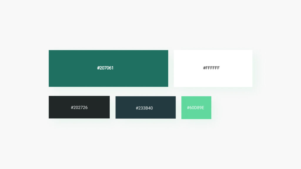 The colour palette we chose for eForest's final design is a perfect mix of nature and technology
We wanted to present a contemporary take on a traditional concept that forests are. Adding on to the project's colouring, we decided to go with a font that would best complement it. With web app design we also kept in mind that the typeface we use needs to meet all the usability requirements.
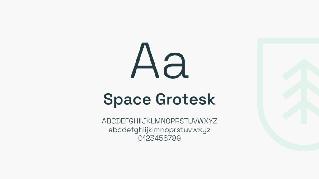 New typeface (Space Grotesk) adds a modern feel to the design
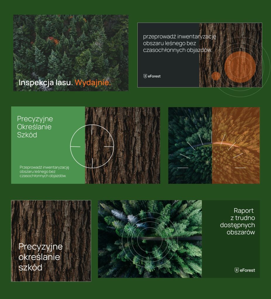
After making all the strategic decisions, it was time to implement them into the mockup. The raw version of eForest was coloured in and enriched with minimalistic icons, playing off the logo design. We achieved a cohesive brand identity of the product, ready to conquer the world of forestry.
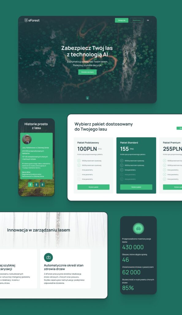 The end result of eForest web app is a contemporary and lightweight design
Thank you!
Hero/dot is a multidisciplinary team of skillful designers, developers, and strategists who work together to develop striking digital products.
We are a trusted partner for many renowned companies, including major sports organisations and enterprise companies.
Want to work with us? Contact us via hello@herodot.com. Also, make sure to check out other case studies!
Need expert assistance with your digital project?
Recent from Mania Dąbrowska
